Your homepage is the most important page of your website. It provides an overall introduction about your brand and what you are offering. Visitors first review your homepage and then decide whether they want to become your customer or not. Thus, the homepage layout has to be visually appealing and flawless.
But how do you design your homepage aesthetically pleasing and convert website visitors on the first visit? It’s simple. Make your homepage following the 9 homepage design principles and it will be perfect, well balanced, and guide the audience toward the call-to-action button. Continue reading to learn about the most important principles and make a web design that impresses everyone.
9 Fundamental Homepage Design Principles
Here are the essential website homepage design principles you must use to create an effective and user-friendly website.
Think of a Simple Homepage Design
Users prefer a simple homepage layout. It should not be filled with overwhelming information. You solely need to convey relevant information with content, images, and links. Here are the things you need to keep in mind while designing a simple homepage.
- Every website content on the homepage should be easily understandable, relevant, and connected. You need to guide the audience by answering their queries, influencing them to see more of what you are offering, and taking action. Add product or service page links with relevant content so that visitors do not have to go to the menu or navigation bar to visit other pages.
- Try to use fewer motion graphics as often users think of them as advertisements, however, if you think one or two motions are necessary to portray your brand message, feel free to use them. Also, use fewer and only relevant images on the homepage to ensure it does not get overloaded. The more motion graphics and images you use, the longer time it will take to load the pages.
- While designing a homepage, keep users and mobile in mind and you will be able to make an amazingly simple, mobile-friendly, and audience-friendly homepage that is fully functional, and easy to navigate. Here is a good website example of a simple homepage design: Par Pacific.

Good Balance Around the Homepage
Next on our homepage design principle is “Visual Balance”. Good balance creates visual harmony and provides your website with an overall aesthetically pleasing look. There are three types of balance designers use – Symmetrical, Asymmetrical, and Radical. I will give you a good example of asymmetrical home page design with the Next Bell Ltd. website.
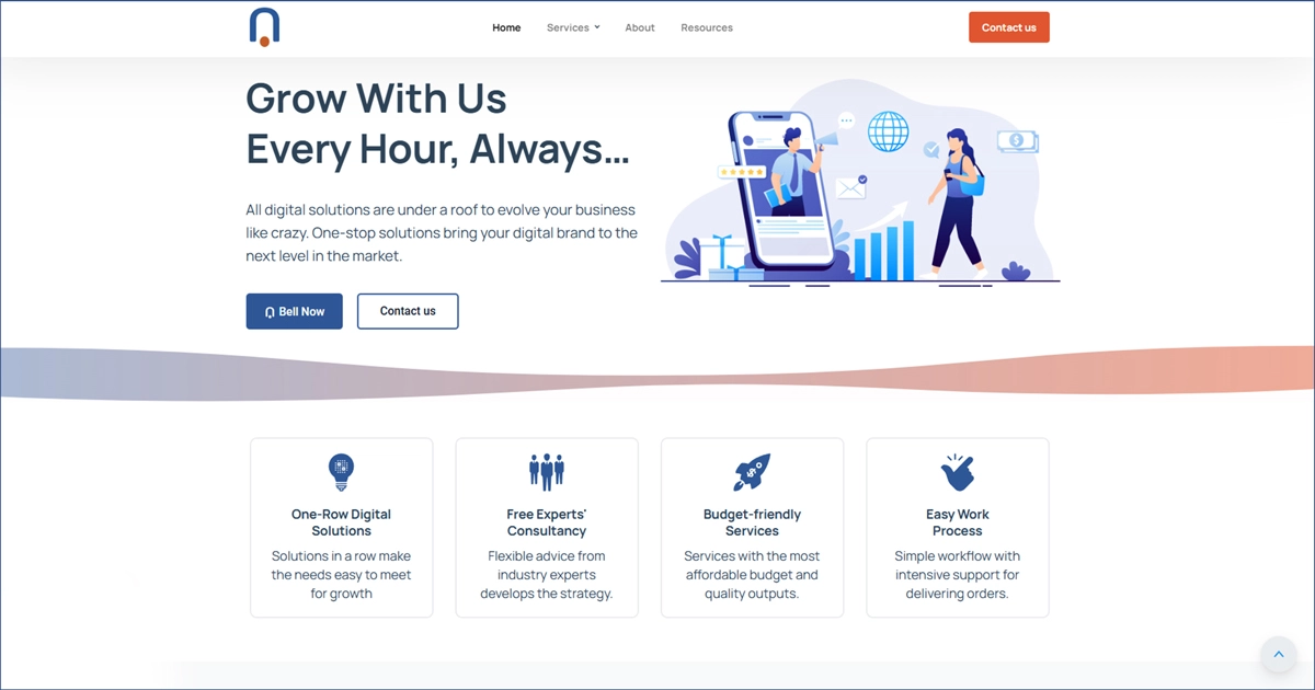
This website’s hero section is a good example of an asymmetrical balance. The image is on the right and the heading and a small paragraph are on the left, creating a great visual weight on both sides. The typography on the left is also precisely written covering what digital services they are offering. The whitespace, image placement, font size, and call-to-action button make the hero section an eye-catching place for visitors.
Whether you use symmetrical, asymmetrical, or radical balance, ensure it highlights your brand, making users skim through your page easily and consume and understand the content fast.
Use Alignment Wisely
When we say website alignment, it usually refers to text alignment and how texts are placed on the website. Designers usually use 4 types of text alignment – left, right, center, and justified. However, your choice of alignment makes the content interesting, decorative, and fun to read. We do not have to go too far to see a good alignment placement example, BBC News is just one step away.
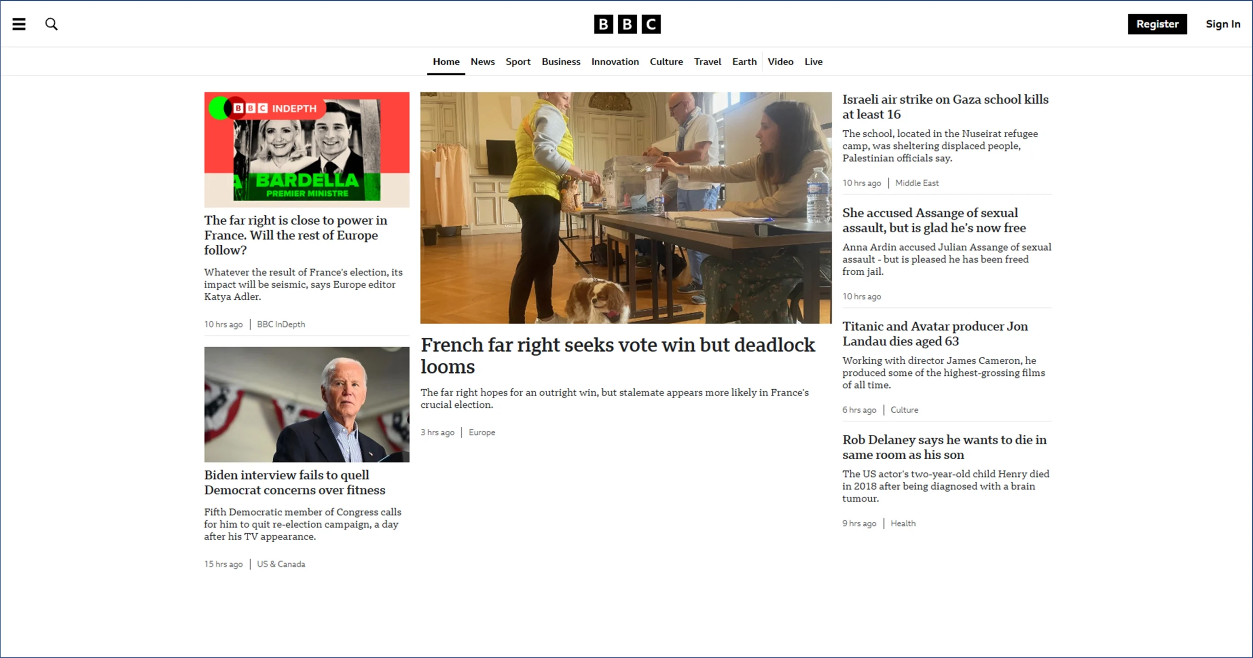
BBC’s homepage is designed with left alignment and they kept the consistency using left alignment throughout the page, making it easier for the visitors to get used to the text placement.
For example, when I visited the BBC website, I read the news headlines from the left and kept reading from the left. My brain naturally took my eyes to the left while starting to read a line. Thus, following the same alignment throughout the page makes it easier for visitors to read and consume the content in the same pattern.
It was an example of left alignment. You can use the right, center, justified, or left according to your homepage design and niche, however, keep consistency. If you mix alignments, it may break visitors’ concentration and make it harder to skim the sections. Remember, providing the best user experience is the most important to convert them into customers.
White spacing for a Clean and Visually Appealing Layout
Spacing is related to balance and alignment. Using the correct white spacing elevates your alignment and balance and enhances the content quality. Thus, be generous with spacing. Experiment with proximity and apply the one that balances the whole content, ensuring easiness in the reader’s eyes, and skimming and understanding information in one go. Parpacific is a good example of nice breathing spacing between content.
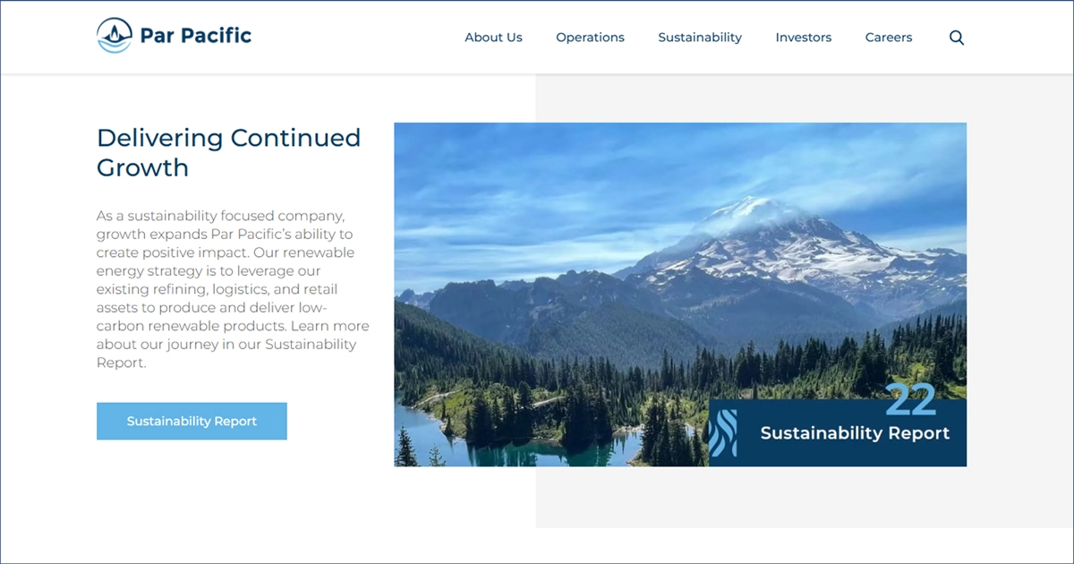
The Par Pacific hero section is simple and minimal. Their other sections also have a lot of breathing space between content and images, making it easier for the site visitors to move on to the next section and understand who they are and what they do as a company. Their white spacing and setting of the images in the sections are also really well-balanced.
Thus, while creating the dynamic website proximity between heading, content, images, and others, you need to maintain a good distance, creating a brand personality, a good balance, and guiding readers’ focus sequentially.
Repetition
Designers often neglect repetition because they think it can make the website boring. However, it is the opposite. It creates consistency, unity, and cohesion between all the elements of the website and helps the audience get used to the content in the same manner. A good repetition example is Color Clipping Ltd. homepage design’s typography.
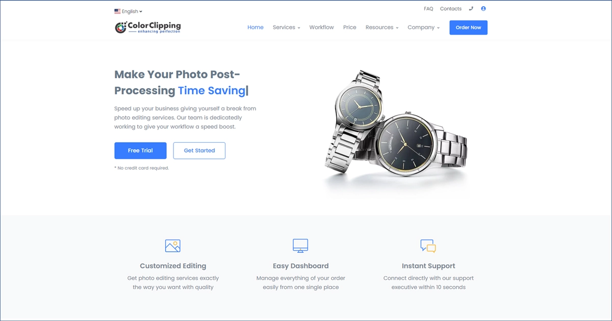
Color Clipping follows a modern website design and every paragraph is designed the same. They followed the same pattern with font sizes, H1, H2, buttons, spacing, styling, header, and footer, creating great consistency throughout the website. It helps users get used to the website’s design pattern and read typography with ease.
All in all your H1, H2, and other headings should look the same, guiding the audience to which point is more important and which point is less important. Ensure maintaining consistency throughout the website to create your brand personality and guide visitors toward the call-to-action button.
Chronology
The next important homepage design principle is chronology. It is important for both the target audience and search engines. Your homepage design must maintain a chronology answering searchers’ queries like telling a story.
From the hero section to the footer, every section needs to be user-friendly and answer every question searchers may have. For example, you tell what your company is about in the hero section then, what are the services you are providing, why take your services and not your competitors, and more.
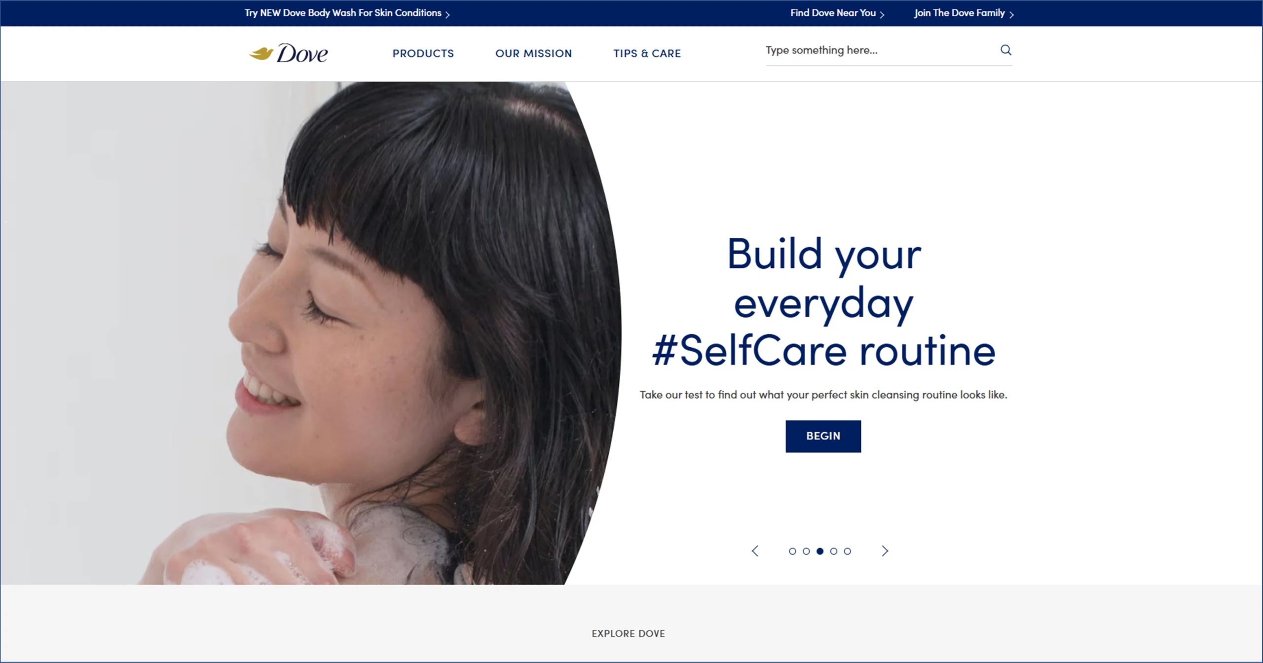
From more important to less important, you need to sequentially organize the details and portray the correct messages in order. A nice example of a chronologically designed website is Dove.
Contrast
Using the right contrast is super important to stand out from the competition. It not only goes with typography, and background but also all the color selection of the website.
Typography – Websites use different types of fonts in headings, sub-headings, and paragraphs, emphasizing the importance of the text and guiding visitors’ eyes to the key points. It also shows the hierarchy, making it easier for the audience to skim and consume the content.
Color of the Text and Background – While choosing the text and background color, you need to ensure the text looks good and is easily readable against the background. Thus, use a well-matched contrasting color from the color palette to elevate your website homepage design.
Color Usage of Overall Website – You need to maintain consistency in using colors in the website. Do not go crazy and use multiple colors. Stick with two or three colors that represent your brand and create a brand identity.
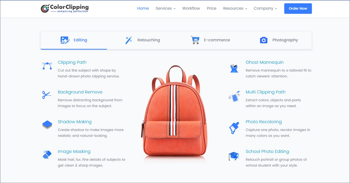
Color Clipping Ltd. is again a good example of using contrasting colors in their website homepage design. It is their service description section. As you can see, they have only used two to three colors on their websites, keeping it super simple and highlighting important parts for the audience to skim and scan.
SEO-friendly, Relevant, and Skimmable Content
We are done with what you need to keep in mind while designing a homepage. However, a website without content is useless. So, here comes the next important principle.
You need to fill your homepage with SEO-friendly content. Research the top 10 competitors and relevant keywords. Write creative and unique content from the “target audience” point of view and try to start the sentences with a gerund (verb+ing), or verbs. Write precisely in short sentences with a length of 4-5 line paragraphs, using easy and common people language that is easy to scan, read, and understand. Also, remember to write in chronological order.
Fully functional URLs and Links
The URL should be similar to the brand name. Safe to use brand.com because most people search with a .com such as nextbell.com and it can be used in any search engine. You need to ensure the URL is properly working or it will not get found in the search engine.
Design the navbar in organized sections so that each category and sub-category can be found in order. Ensure the menu/navbar is clickable and fully functioning.
Lastly, do not forget about internal linking on the homepage. The homepage has to be linked with every product or service page you provide so that site visitors can check other web pages from then and there hassle-free.
Final Verdict
Knowingly or unknowingly, every website follows two or three homepage design principles, however, it is not enough. You need to follow all 9 design principles to create an amazing, effective, and user-friendly website. The mentioned first 7 principles are solely dedicated to homepage design and the last 2 principles need to be applied after you have built a website. So, create a website that speaks to your brand value in a unique tone and stands you out from the competitors.
Lastly, if you need professional web design and development services in building your digital home, we are here to help you. We will follow your instructions and design a website that speaks to your brand identity within the deadline. We also provide SEO, content, graphic design, and social media services. If you need any other services, contact us. Take a free consultation and if you like the plan and work we do, let’s make a deal! For today, Adios!
It is the introductory/main page of a website from where visitors get the initial idea about the brand and what they are selling.
It is the "home" of the website where every web page is linked and through which you can roam around other pages and make purchases.
The homepage provides an overall introduction about your business like what you are selling, benefits, why visitors should buy from you, and more.
Your target audience. Your homepage needs to be amazingly designed, user-friendly, and easily navigated so that the audience can spend an amazing time and convert.


