Your website is a digital home that represents your brand. You need to plan it following modern website design trends. Alongside smooth navigation and excellent user experience, your website needs to be trendy and eye-catching to captivate your audience at first glance.
To help you make your dream website, we have created this article on the latest web design trends. Here, I will explain the complete list of web design styles that will rule in 2024.
Modern Website Design Trends of 2024
Website design styles vary depending on niches. If you are a newspaper publishing company, your website will have more text and images than 3d elements or videos. Thus, choose your website design from the latest modern web trends below.
Neon Supremacy
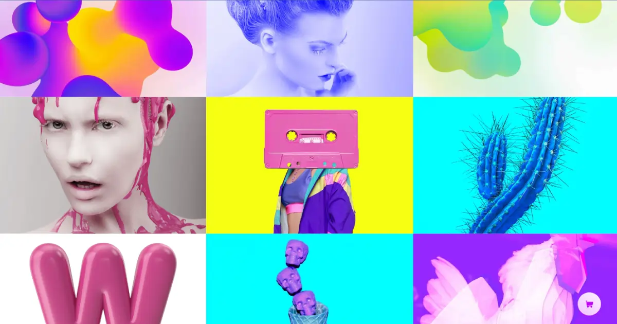
Neon-colored websites always look aesthetic and they will be super trendy in 2024. They provide a soft glowing effect, vibrant light, a touch of enchantment, and capture the viewer’s attention instantly. Neon color also goes well with any type of background and is best with black. They double up the website’s beauty.
Especially when you combine it with black, not only does it look enchanting but also makes it easier on the viewer’s eyes. You can also experiment with different colors to create a website that speaks your brand’s purpose and stands out from the crowd. For example, the Whoop website is made with a combination of neon and other colors and it looks aesthetically pleasing upon first visit.
Dark Mode
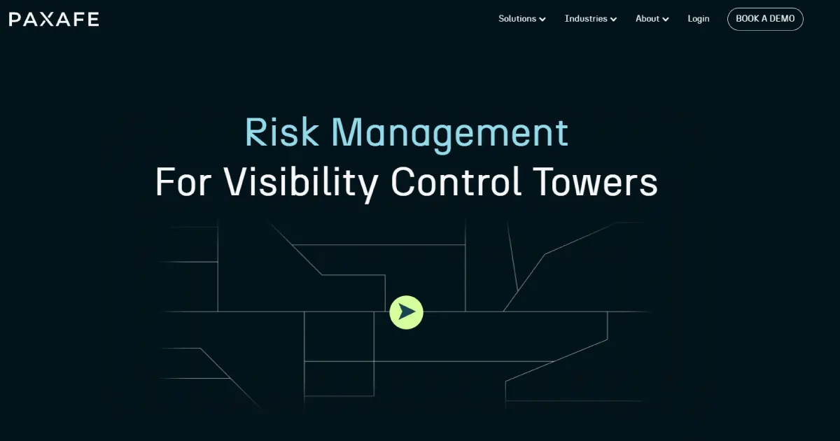
Dark-mode websites are a great choice for any niche and provide visual appeal with different color combinations. For example, Paxafe is a software website, and man, it justifies the brand so well. The website has dark background with light gray text alongside, pastel green and blue accents.
There are great benefits to dark mode websites such as providing a modern professional look, being easier on the viewer’s eyes, and saving batteries. The biggest benefit of all is that people with low vision and light sensitivity can also see things clearly. Thus, making your website dark mode will help you access most of your target customers and this web trend is not getting old soon.
Vibrant Colors
Colorful website trends are challenging to follow because if the color combination does not blend well, it will look annoying making the visitor leave faster. However, if blended perfectly, it provides a visual treat to visitors.
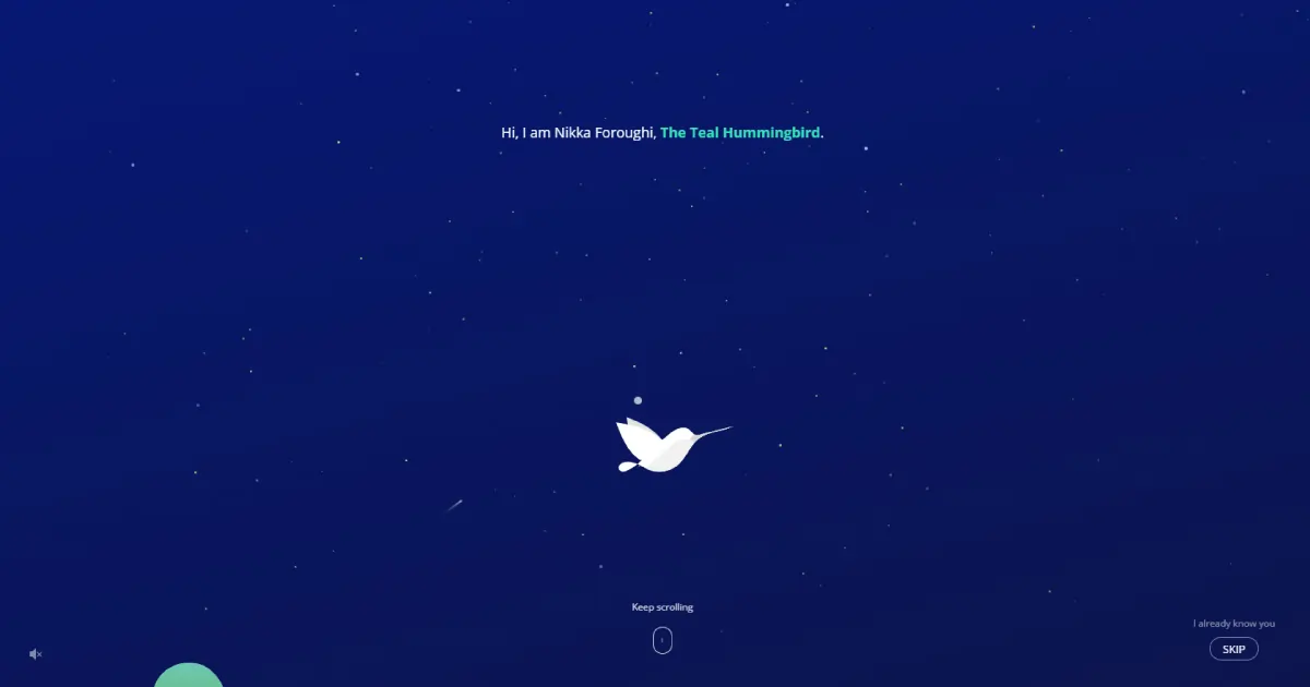
So, use color palettes that accurately represent your brand. Ensure the colors match your website layout and scream who you are. For example, Nikka Foroughi’s website.
perfectly portrays his brand purpose (UI/UX design). It welcomes visitors warmly with music and with the user scrolls, you give the hummingbird a life. This website makes you curious and want to keep on scrolling.
Thus, if you have the confidence to pull out of this challenging website style. I highly recommend colorful and vibrant websites because it is trending in 2024 and will stay in trend for a long time.
3D Elements
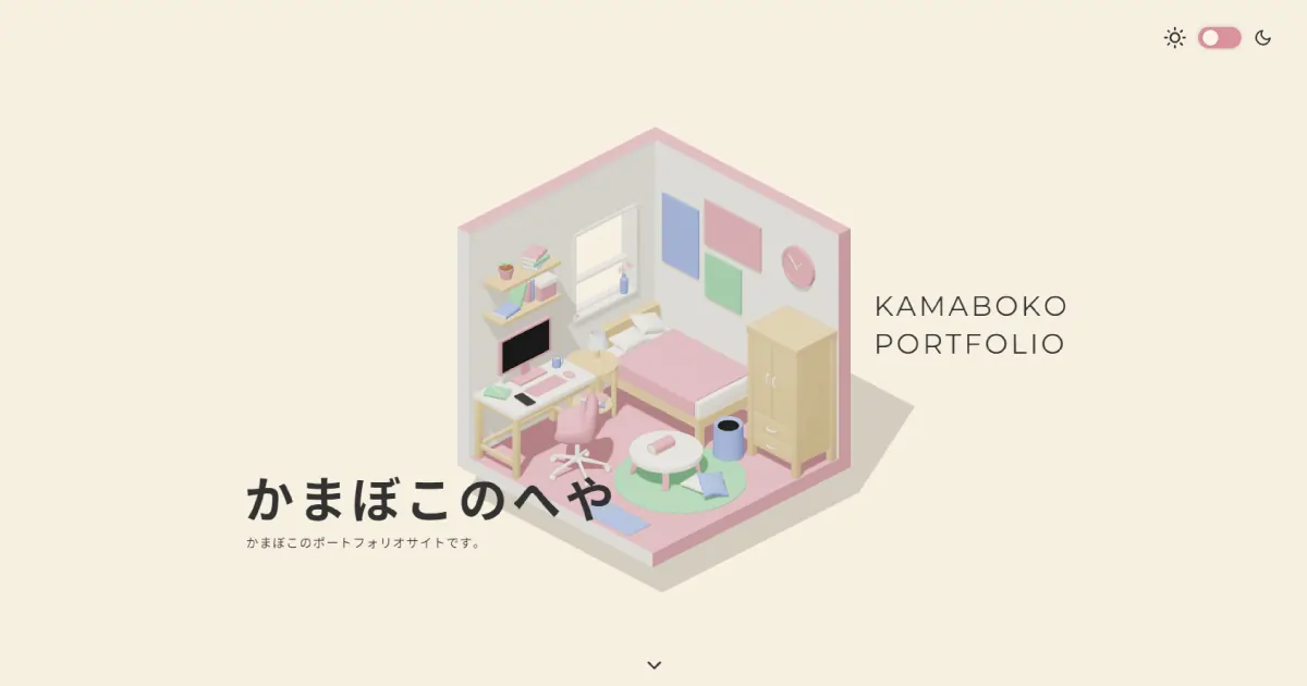
3D websites are visual feasts to the eyes. You just open a 3D website and sit, it will tell you its unique story. For example, the Kamaboko portfolio website. When you open the website, the small box will start moving slowly and within a few seconds, it will show a student’s small living space in Japan. The 3D website design will keep you engaged throughout the process and the light color combination is just so visually appealing.
3D dimensional designs are creative, engaging, interactive, and memorable. It takes users on a journey and keeps them hooked like they are a part of the experience. Though 3D design load times are a bit slow, it is a great way to interact with users because, with curiosity, they will explore your website and become your customers.
Also, ensure the 3D designs portray your brand identity and guide users smoothly like the Komoboko portfolio website.
Custom Illustrations
The website trend for custom illustrations is growing more and more because of their uniqueness. The illustrations make the sites look more authentic and artistic.
Professional graphic and video editing services can experiment with various things and make your website with your personal tests. Each section can look different and portray different messages. However, ensure the audience does not feel lost with variation and can sync and enjoy each page of your website.
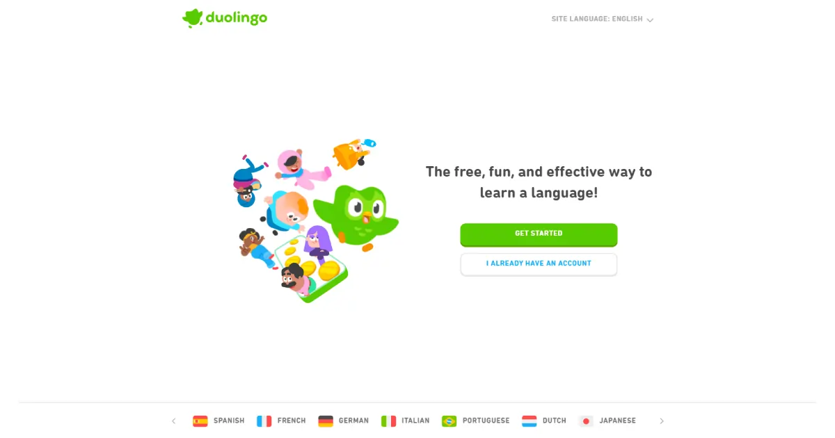
Here is a perfect example of custom illustrations. Duo Lingo.It is a language learning platform that keeps the audience hooked with visual appeal. The platform is made with illustrations and iconography. Even if you do not like to study, the designs and educational content are easy to interact with making the students learn language with focus and fun.
Micro Animations
Micro animations have been trending for a while now because of their ability to bring life to objects. The animations clarify your brand purpose in a detailed manner. Without them, the website looks boring with just images and text. It is especially attractive when you use it in the hero section. It may take time for pro web designers and developers to perfect the micro-animations but it looks awesome when perfected.
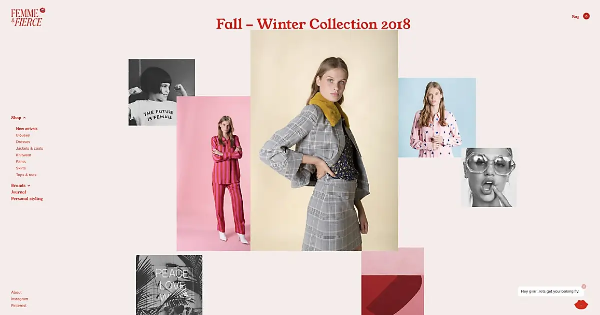
A perfect example of a micro-animation website would be Femme & Fierce. It is a fashion retailing website that works with vibrant colors, contemporary designs, and loud prints. When you visit the website, the products shine. Move the cursor over the product and you can see it from different angles with different graphic elements like kisses, lollypops, and so on. It is a fun, vibrant, and interesting way of presenting your products to users.
Massive Typography
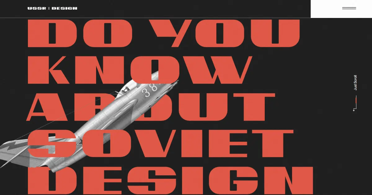
Larger and larger typographies are becoming a web trend. The massive texts captivate the audience’s attention immediately making them focus on the statement. Web designers and developers create websites using big typography rather than visually attractive images and videos. It speeds up the website and improves site performance. Also, using big text for the call to action can help you deliver the message clearly.
For example, the USSR Design Almanac Soviet-designed website. The design element is made of black, white, and red combinations. After you go to the website, it welcomes you with images from 1922 to 1991. The images portray the buildings, airplanes, cars, and other things of that era.
The dynamic website shows the legacy and lifestyle of people. With the user scrolls down, the images and texts appear with simple explanations. The website is truly visually appealing and the large texts make the users read the information with ease. I personally liked the website design elements because of the texts and images appearing artistically, making me want to see more of what they offer.
Custom Cursors
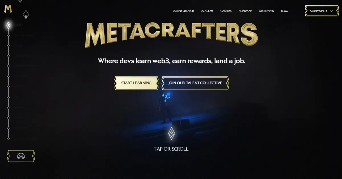
Do you like playing with cursors like me? For people who like to play with cursors, designers have started customizing different cursors in their brand. It is a small design element but it will stand out from the rest. Each customized cursor looks different guiding users through the website and providing an amazing online experience.
Metacrafters is a beautiful example of custom cursors. It is a platform where students can do training on blockchain, earn rewards, and get a job. The website itself is very visually appealing, enhancing its beauty with a diamond-shaped cursor that provides users with an immersive online experience. Thus, design a cursor that represents your brand and makes it look out of this world.
Bento Style
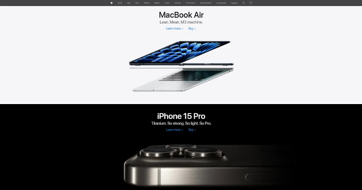
Bento box web design styles are interesting and can be used for any type of niche. It is divided into configurations like 3×3, 5×5, or even in different sizes. The block sizes look interesting and creative. Since, the bento box website design is getting popular now, apply it to your brand and stand out. Remember, every bento box looks different thus, experimentation can be done.
The Bento box website style became popular with Apple. With bento style, the iPhone 14 Pro provided its features introductions. They creatively used gradient text and size to portray the message ensuring every box looks visually appealing.
Simple & Minimalist Design
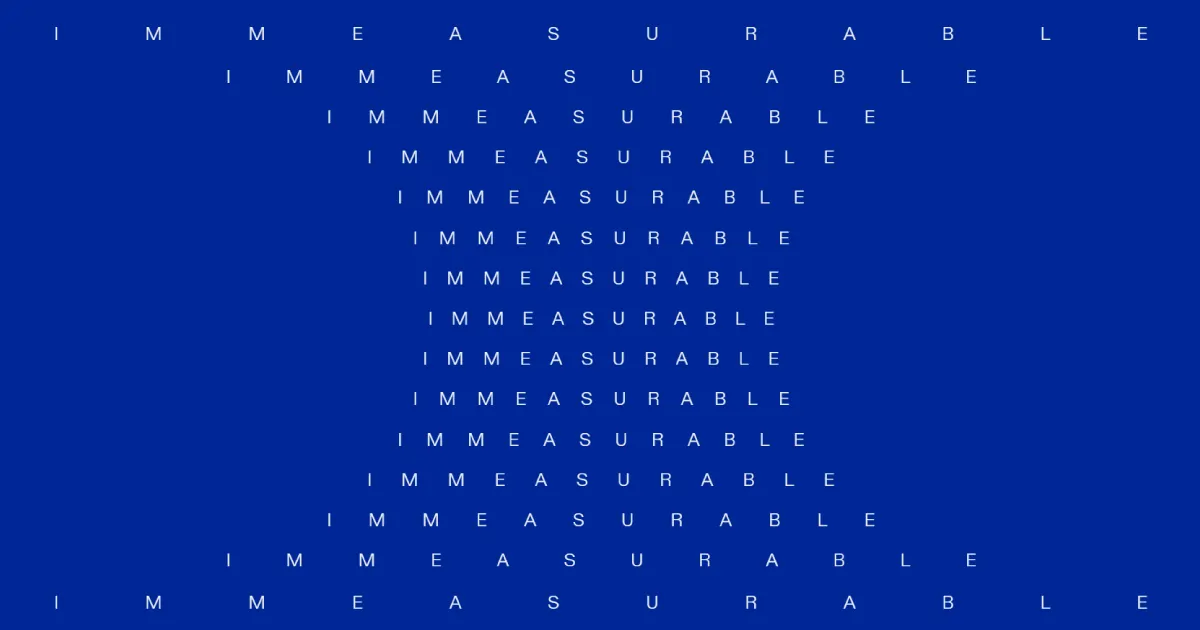
Minimalist designs never went out of web trends and still thriving actively. The minimalistic websites remove any unnecessary elements, keeping the key content users need. The websites are clean, easily navigated, and fully functional. However, every aspect of the site needs to be eye-catching and flawless.
It is a bit difficult to make a minimalist website but if successful in portraying brand purpose, you will become popular without a doubt. Because these websites look eye-soothing also, the featured products become the heroes.
A great example of a minimalist website is immeasurable. It is an investment company. The site opens with its name spread like a tree because this company believes in values that can’t be measured like character, determination, and adaptability. The home page is simple but provides the brand’s unique charm like a pro.
Responsive Designs
Regardless of choosing any web design trends like a bento box, micro animations, or dark mode, you need to ensure the website is fully responsive on any device. Every page, menu, navbar, link, header, footer, page URLs, images, and text need to work flawlessly. Thus, while designing your website, double-check everything and see how your website is working on other devices.
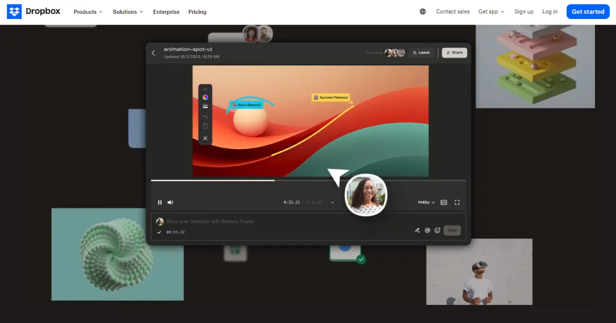
Dropbox is an awesome example of responsive web design. It is a file-sharing platform. Their hero section is amazing where happy clients can be seen. Their site has additional features and the uploading speed is super fast. Their site is fully functioning and easy to use.
Let’s Wrap Up
When choosing any modern website design trends, you need to keep your niche in mind. The users have to say Wow! Your website is amazing. Choose color palettes and hue combinations wisely. Everything from the design to text selection and making the sections should be in sync and eye-soothing. The audience should not feel lost and find the call-to-action button easily. Also, fully check the website functionality before live it to search engines.
Lastly, If you have already chosen your desired website and want to decorate it according to your brand identity, contact us. Our professional web designers and developers follow client requirements fully, ensuring the website looks visually appealing and authentic. Don’t believe my words. Visit our website and take a free consultation. If you like the solutions we provide, make the deal!
Though 100% virtual reality websites can not be made yet. It is a great approach for e-commerce websites as users can see the product outlook in different scenarios in real-time. It will increase sales rapidly and popularize your brand.
It is the opposite of minimalism where you can design your website with quirky and fun stuff and break rules to stand out your website.
Before Javascript created amazing visual effects. However, now CSS can do a lot of complex stuff like 3D transform filters, cascade layers, container queries, and so on. So, to make a modern website, CSS will be more helpful than Javascript.
